

As a content creator, you know that building an audience (and a business) often starts with a simple form. Whether it’s a newsletter signup or a course registration, form builders are the unsung heroes turning casual visitors into engaged subscribers – and eventually, paying customers. In fact, an online form is not just about data collection; it’s the first step in your revenue funnel. Imagine if that basic email capture form could do more than gather names – if it could guide your audience from “nice to meet you” to “here’s my credit card.” That’s exactly what we’re covering in this comprehensive guide.
In “From Email Capture to Revenue: A Creator’s End-to-End Form Strategy,” we’ll walk through every stage of leveraging forms for growth. From choosing the right form builder tool all the way to handing off to a custom solution once you’ve outgrown plug-and-play options, consider this your roadmap. Along the journey, you’ll learn how to craft friction-less form fields that maximize signups, how to embed upsells and tripwire offers for immediate revenue, and how to automate nurturing with your email service provider (ESP) or CRM so no lead goes cold. We’ll also delve into analyzing form performance (because what gets measured gets improved!) and even discuss when it’s time to go headless – switching from a standard form builder to a custom, code-driven form for ultimate flexibility.
This isn’t a fluffy overview; it’s a tactical, step-by-step game plan. We’ll sprinkle in the latest trends like AI-assisted form creation, conditional logic, mobile-first design, and even embedding video and payments into forms. And since creators are often ahead of the curve, we’ll touch on fun experiments (think AI vs. human-designed forms, or the classic multi-step vs single-step form face-off) to see what really works. By the end, you’ll see forms not as boring boxes to fill, but as dynamic funnels that actively drive ROI for your creator business.
Let’s dive into the form funnel strategy, stage by stage – turning those email captures into real revenue!
Table of Contents
- Choosing the Right Form Builder Tool
- Crafting Friction-less Form Fields
- Embedding Upsells & Tripwires in Your Form Funnel
- Automate Nurturing via Your ESP/CRM
- Analyzing & Optimizing Your Form’s Performance
- Hand-off to Headless: When You Outgrow Form Builders
- FAQs
1. Choosing the Right Form Builder Tool

The first step in your form-to-revenue journey is picking the right tool for the job. The good news is there are many online form builder platforms out there; the challenge is finding the one that fits your needs and your audience’s expectations. As a creator, you want a form builder that’s easy for you to use, provides a smooth experience for your fans, and supports the fancy features (like integrations or payment collection) you’ll need as you grow.
Key factors when choosing a form builder:
- Ease of Use: If you’re not a coder (and most creators aren’t), a drag-and-drop interface and intuitive editor are a must. You should be able to build a form in minutes, not hours.
- Customization & Branding: Your forms should feel like an extension of your brand. Look for tools that let you customize colors, fonts, and add images or logos – without needing a design degree.
- Features & Flexibility: Think ahead about what you’ll need. Do you plan to include conditional questions that show/hide based on user input? Accept payments for a digital product or event? Embed videos or rich media? Ensure the platform supports those features (or has plugins) so you won’t hit a wall.
- Integrations: A form doesn’t live in a vacuum – it feeds your email list, CRM, maybe a Google Sheet or Slack notification. Check that the form builder connects with your Email Service Provider (Mailchimp, ConvertKit, etc.), customer databases, or Zapier for everything else.
- Analytics: Since we’re treating forms as revenue funnels, you’ll want to track performance. Some tools offer built-in analytics (views, completion rate, drop-off points). At minimum, make sure you can embed Google Analytics or other tracking codes to measure conversions.
- Pricing: Many form builders have free plans or trials (great for starting out), but costs can ramp up as your audience grows. Compare pricing tiers, especially limits on form responses or premium features. A “free form builder” like Google Forms might work initially, but investing in a paid platform can pay off with higher conversion features.
Now, let’s look at a few popular form builder options for creators and what makes each stand out:
- Typeform – Engagement-first forms. Typeform is famous for its one-question-at-a-time interface that feels more like a conversation than a form. People often enjoy filling out Typeforms because of the clean design and interactivity. It’s perfect for creators who want to impress users with a sleek experience – say, an interactive survey or a playful signup quiz. Typeform supports conditional logic, can accept payments via Stripe, and has tons of integrations. Keep in mind, the generous design comes with a higher price tag on paid plans, and the free plan is quite limited.
- Outgrow – Interactive content king. Outgrow specializes in quizzes, calculators, polls and other interactive experiences that double as lead forms. For example, you could create a “What kind of entrepreneur are you?” quiz or a savings calculator that provides personalized results – but requires an email to show the outcome. This is gold for engagement: users get hooked by the interactive content, then give you their contact to get something valuable. Outgrow has templates for these experiences and basic analytics to see engagement. It’s a bit more niche than a classic form builder, but for creators looking to gamify lead capture or offer unique value (like an ROI calculator or assessment), Outgrow is a top choice.
- Jotform – Feature-rich veteran. Jotform has been around for over a decade and it’s like the Swiss Army knife of form builders. You get a drag-and-drop editor with dozens of field types (from e-signatures to file uploads to yes/no sliders), thousands of templates, and integrations from PayPal to HubSpot. Jotform shines if you need a free form builder to start – their free plan allows 5 forms and 100 submissions a month, with Jotform branding. As your needs grow, Jotform can scale up to support payment forms, conditional logic, and even approval workflows. Some creators find the interface a bit old-school or clunky compared to newer tools, but it’s continuously improving. If you want reliability and depth of features (and a generous free tier), Jotform is a strong pick.
- Paperform – Forms meet landing pages. Paperform is like a fusion of a doc editor and a form builder – it lets you create beautiful, rich webpages that have form questions seamlessly embedded. For instance, you can write a paragraph or add an image, then ask a question, then more text, then another question. The result doesn’t feel like “fill out this form” – it feels like a personalized landing page or survey tailored to the user. This is great for creators who want to provide context or storytelling alongside form fields (think: an RSVP page with details and a signup form in one). Paperform supports payments (Stripe, PayPal, etc.), so you can even sell products or accept donations in the form. With conditional logic, answer piping (using previous answers in later questions), and lots of integrations, Paperform is super versatile. It’s paid-only after a brief trial (no long-term free plan), but for a polished, on-brand look, many creators love it.
- MakeForms – AI-powered new contender. MakeForms is a newer online form creator that’s making waves by bringing artificial intelligence into form building. Its AI Form Builder can literally generate a form for you in seconds: you provide a form name or a brief description of what you need, and it suggests a form structure and questions. This can be a lifesaver if you’re not sure where to start or want to speed up your workflow. Beyond the AI angle, MakeForms offers strong security and compliance (think GDPR, HIPAA – indicating they’re serious about data protection), which might appeal if you handle sensitive info. It has all the expected features like conditional logic, custom branding, and embedding options. As a newer tool, you might not find as many community templates or integrations as the big players yet, but it’s evolving fast. For creators who love to try cutting-edge tools (and hate staring at a blank form), MakeForms is worth a look.
- Google Forms – Old reliable (free but basic). We have to mention Google Forms because it’s ubiquitous and free. For a creator just starting out or testing an idea, Google’s form builder is a quick solution: it’s extremely easy, and responses go into a Google Sheet for you. However, it has notable limitations. Design customizations are minimal (your forms will look like Google Forms, not necessarily like your brand). There’s no built-in logic for advanced flows (aside from simple “go to section based on answer” which is there, but not as intuitive as others). And forget about payments or direct integrations – you’d have to manually move data or use add-ons. In short, Google Forms is great for internal surveys or basic signup pages in a pinch, but if you’re serious about conversion and branding, you’ll likely outgrow it quickly. Consider it a stepping stone to the more powerful form builder platforms above.
Choosing your tool comes down to matching the platform to your project and audience. If you’re running a playful quiz to engage TikTok followers, a visually engaging Typeform or Outgrow experience might be best. If you’re simply collecting emails for a newsletter, Jotform or Paperform could give you a quick, professional form embedded on your site. And don’t be afraid to try a couple out – most have free trials or plans. The goal is to find a form builder that you feel comfortable with and that provides a frictionless experience for your audience. After all, every extra hurdle or annoyance in the form could mean a lost lead.
Quick Win: Test-drive a couple of form platforms with a simple signup form. For example, create one form in Typeform and the same form in Google Forms, then share both with a few friends or fans for feedback. See which one gets a better response and feels more user-friendly – this little experiment can speak volumes about what your audience prefers.
2. Crafting Friction-less Form Fields
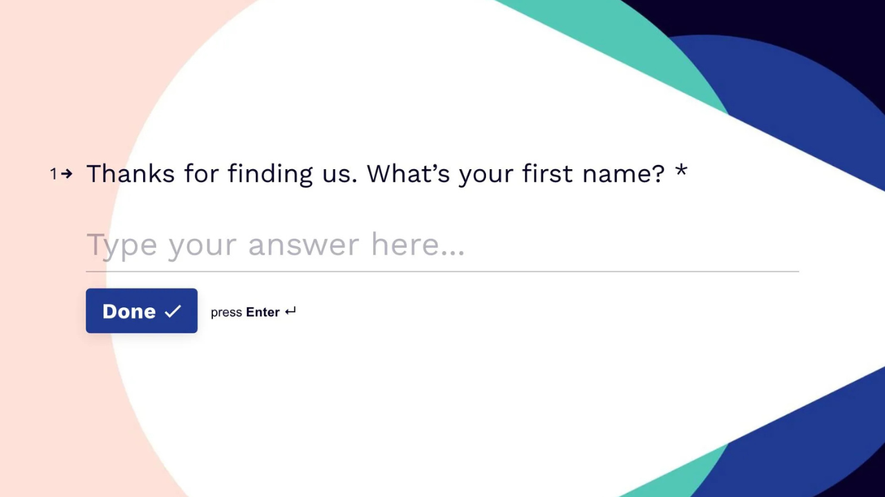
Once you have a form builder picked out, it’s time to create the form itself – and here’s where many creators either win over their audience or unwittingly turn them away. Friction-less form design means making it as easy as possible for someone to complete your form. Every extra second or confusing question can reduce the chances of that visitor hitting “Submit.” Let’s ensure your forms are smooth as butter.
Keep it short and sweet (especially at first): The golden rule is to ask for only what you truly need. If your goal is to capture emails for your newsletter, do you really need their mailing address and favorite color upfront? Probably not. Each unnecessary field is an opportunity for a user to bail. You can always collect more info later as your relationship grows (a concept known as short profiling). For initial contact, an email and maybe first name might be plenty. Remember, from the user’s perspective, a shorter form = a quicker freebie or signup.
One thing at a time: A big wall of questions can intimidate anyone. Many modern form builders (Typeform, Paperform, etc.) allow you to show one question at a time or break your form into steps. Multi-step forms are proven to boost completion rates for longer forms – because they never overwhelm the user with too much at once. If you have 10 questions, consider splitting them into 2–3 steps or pages. The user will feel like it’s a series of small easy tasks, instead of one giant one. Even on a single page form, you can use clear section headings and spacing to avoid the “eternal scroll” effect.
Use clear, simple language: Now’s not the time to flex your vocabulary or get overly quirky with field labels. Make sure each field’s purpose is obvious. Instead of “Provide your coordinates,” say “Your Email Address.” Instead of a cryptic “How can we assist?” perhaps “What do you want to learn or get?” as a question. Also, include helper text or examples if a field might be unclear (for instance, if asking for a handle or ID, specify the format). The less a user has to think about what you’re asking, the faster they can answer and move on.
Leverage conditional logic: This is a power move for friction reduction. Conditional logic means the form can dynamically show or hide fields based on previous answers. For example, if one question asks “Do you have a website? (Yes/No)” and the user selects “No,” you can choose not to display the following question that asks for their website URL. Why force someone to skip or think “N/A” for a question that doesn’t apply to them? By tailoring the form to each user, you shorten the perceived length and avoid confusion. Most advanced form builders (Jotform, Typeform, Paperform, etc.) have this feature – use it to keep things relevant. Your subscribers will thank you for not wasting their time.
Design for mobile-first: Odds are, a large chunk of your audience will open your form on their phone. If your form isn’t mobile-friendly, you’ll lose those folks in a heartbeat. The good news: all major form tools provide mobile-responsive forms out of the box. But you should still test it on a phone screen yourself. Are the text and buttons large enough to tap? Does the layout require side-scrolling or zooming (hopefully not)? Perhaps swap out dropdowns for radio buttons or scroll wheels on mobile to make selection easier. Also, enable features like mobile-friendly keyboards (for example, show the numeric keypad for number fields, or the “@” keyboard for email fields) if your form tool supports it. A truly mobile-first form feels as easy as sending a quick text.
Minimize friction in validation and required fields: There’s nothing more frustrating than a form that rejects your input without clear reason (“What’s wrong with my password?!”). If you require certain formats (like a phone number with area code), either provide a hint (“e.g., 123-456-7890”) or use field masking to guide input. Only mark a field as required if it’s essential – psychologically, people are more willing to fill non-mandatory fields because they choose to, rather than feeling forced. A neat trick: if you have one optional field that many skip (say, a “How did you hear about us?”), you can leave it optional to reduce friction – you’ll still get answers from those who are happy to provide, without scaring off others. Lastly, if a user does slip up (like missing a required question), make the error message friendly and specific: “Oops, we need your email to send the guide” is much better than a red exclamation with no explanation.
Offer alternatives to typing when possible: Typing, especially on mobile, is tedious. Where you can, use multiple-choice options, checkboxes, or dropdowns instead of open text fields. For example, instead of asking “What is your budget?” as an open field, you could present ranges (“<$100, $100-$500, $500+”). This not only makes it easier for the user to answer with a quick tap, but you also get standardized data that’s easier to analyze. Another example: if country or state is needed, a dropdown list prevents misspellings. The caveat is not to go overboard – if you have too many options or the question truly needs a personal answer, a short text field is fine. Just be mindful of where you can save a few keystrokes for your audience.
Make it engaging (when appropriate): Forms don’t have to look like 1990s paper forms. You can add a touch of creativity to reduce the “ugh, paperwork” feeling. A welcome message or a friendly brief description at the top can set the tone (“We can’t wait to share our secrets with you! Just need a few details to send your way…”). Some builders let you include an icon or image next to questions – maybe a smiling emoji or a small graphic – which can lighten the mood. Embedded video is a rising trend too: for instance, you could have a short 30-second clip of yourself saying hi and explaining what they’ll get by filling the form. This personal touch can boost trust and completion rates, as the user now sees a human on the other side. Just keep videos short to not distract or slow down the process.
Multi-step vs. single-step – choose wisely: If your form is very short (say, just email and name), keep it one step – adding an extra page would be unnecessary friction. But if you have a longer form, strongly consider a multi-step (wizard-style) format. Studies have found that multi-step forms can significantly increase conversions – users are more likely to complete a form that’s broken into bite-sized chunks. It’s like walking through a few small open doors versus pushing one giant heavy door. Multi-step forms also allow you to ask an easy question first (like “What’s your main goal?” with a few options). Once a user answers one question, they’ve started the process and are more likely to finish (“progress momentum”). Always show a progress bar or step indicator if you have multiple pages – it reassures people that the form won’t go on forever (“Step 2 of 3… almost there!”). On the flip side, if your audience is more tech-savvy and you worry they might bounce at anything longer than a quick form, you could AB test a one-page version. The key is to weigh complexity: for forms with numerous fields, multi-step is usually a winner; for super simple opt-ins, one page is fine.
Pro Tip: Always preview and test your form as if you were a visitor. Fill it out yourself on desktop and mobile. Notice any moment of hesitation or annoyance – is a question unclear? Does the form load slowly? Are you asking one question too many? By experiencing the user’s perspective, you can spot friction points you might otherwise miss. For example, if you find yourself thinking, “Why do they need this info?” about your own form field – you probably don’t need it! Refining those little details can be the difference between a 20% form completion rate and a 50% rate.
Mobile matters. Before you finalize your form, test it on a smartphone. If any field requires pinching and zooming or excessive typing, look for ways to simplify it. Consider using choice buttons, toggles, or voice input for mobile users. The easier it is to tap and go, the higher your mobile completion rates – which means more leads and revenue from those on-the-move users.
3. Embedding Upsells & Tripwires in Your Form Funnel
Congratulations – your optimized form is live and you’re capturing emails or sign-ups. But don’t stop at “Thank you for subscribing.” The moment right after someone fills out your form is prime real estate for turning a new lead into a customer. This is where upsells come into play, effectively embedding revenue opportunities directly into your form funnel.
First, what’s a “tripwire” offer? It’s marketing lingo for a low-cost, high-value offer presented immediately after a lead signs up (tripping the wire from prospect to buyer). Think of something in the $5-$20 range – an irresistible deal that’s a no-brainer “Yes, I want this!” for your target audience. The goal isn’t to make a huge profit on the tripwire itself, but to convert a warm lead into a paying customer on the spot. Once someone has made even a small purchase from you, they’re statistically much more likely to buy again (and at higher prices). Plus, the tripwire sale can offset any costs of acquiring that lead (like ad spend). Upsells are similar, but can refer to any offer (low or high price) you present after an initial action.
Where to embed an upsell/tripwire: The best place is usually the thank-you page or confirmation step right after the form is submitted. Instead of a bland “Thanks for signing up,” use that page to both thank them and offer something extra. For example: “Great, you’re in! Check your inbox for the free guide. Special Offer: Since you’re interested in XYZ, we’d like to offer you [your tripwire product] at 50% off for the next 15 minutes.” This creates a sense of urgency and relevance. The user is already in a mindset of engaging with you (they just signed up), so they’re more open to additional offers than, say, a cold pitch out of the blue.
Another option is to include an upsell within a multi-step form itself. Some creators do this by making the last step of a signup form an offer: e.g., “Would you also like to enroll in the mini-course for $9 now? ☐ Yes, add this to my signup!” With the right form builder, you can incorporate payment collection in that final step. If they check yes, the form dynamically reveals payment fields (credit card details, etc.) and processes the purchase on submission. If no, they simply finish the free signup. This approach streamlines the process into one flow (no separate landing page needed). Jotform and Paperform, for instance, support adding payment fields and conditional sections, which could handle this nicely. Typeform also integrates with Stripe to accept payments – you could set up a Typeform that collects an email, then uses logic to ask “Do you want to take advantage of [offer]?” and if yes, goes to a payment question. Outgrow, known for interactive content, can integrate with payment gateways too, allowing you to gate quiz results or calculators behind a payment if that’s your model (though more commonly, you’d capture the lead then redirect to a sales page).
Crafting the right upsell: Relevance is key. The upsell or tripwire should be directly related to what the user signed up for. If they joined your list for a free “10 Tips to Improve Your Photography” PDF, a perfect tripwire might be “Buy my complete Photography Lighting eBook for just $7” on the thank-you page. It feels like a natural extension of their interest. On the other hand, offering something unrelated (“You signed up for photography tips – buy my keto cookbook!”) would confuse and likely annoy them. Match the upsell to the initial intent. Also, make sure the value is clear and preferably tangible. A good tripwire often has a high-perceived value – maybe it’s usually $30 but you’re giving a special one-time $10 deal. Phrase it as a thank-you gift or a new-subscriber special.
Don’t be too pushy: Yes, this is about monetization, but you still want to start the relationship on a positive note. If the user isn’t interested in the upsell, that’s fine – ensure your thank-you page still delivers value (like instructions to access their freebie, or a warm welcome message). You can present the offer, but make it easy for them to say “No, thanks” and not feel trapped. One method is the classic two-button approach: “Yes, I want the special offer” and a smaller “No, I’ll pass for now” link. This way the user has a clear exit if they’re not into it. You’ve likely seen this tactic on many marketing funnels, because it works without causing (much) annoyance.
Integrate payment smoothly: If someone does click your upsell or tripwire, the last thing you want is a clunky checkout process. This is where your form tool or website needs to handle payments seamlessly. Many form builders allow embedding a payment form or integrating with Stripe/PayPal directly on the spot. If yours doesn’t, you can set the upsell button to redirect to a simple checkout page (maybe on your site, or a platform like Gumroad, ThriveCart, etc.). The transition should be frictionless: ideally, if you already collected their name and email in the signup form, pass that info to the checkout to pre-fill fields. The less re-typing, the better. Some advanced setups even do one-click upsells (if the initial signup involved a purchase with saved payment, but that’s more relevant for after a purchase flow).
Examples of upsells/tripwires for creators:
To spark ideas, here are a few scenarios:
- A YouTuber just got a user to sign up for a free “exclusive video” – on the thank-you page they offer a $5/month membership trial with bonus videos and behind-the-scenes content.
- A blogger captured an email in exchange for a free recipe ebook – immediately after, they pitch a bundle of 4 premium ebooks (usually $50 total) for a one-time $10 offer.
- A course creator has a webinar signup form – on confirmation, they offer a $17 mini-course that serves as a perfect primer for the main course.
- An artist runs a giveaway signup – after entering, participants see an offer to buy a discounted print or merch item right away (limited time special).
In each case, the creator is turning what was originally a pure lead generation play into an opportunity to earn (and more importantly, to identify who the most interested, paying fans are) from the get-go.
Don’t forget upsells after the thank-you page: If someone doesn’t take your tripwire immediately, you haven’t lost them – you’ve still gained a lead. That offer can be reiterated in your first follow-up email (“In case you missed it, here’s a special new-subscriber discount…”). But generally, it’s most effective right on that post-signup page when interest is hot.
Embedded video and personal touch: Remember the trend of embedding video? The thank-you/upsell page is a fantastic place for a short video message. For example, you might embed a video of you saying, “Hey, thanks for signing up! I just emailed your free guide. I also wanted to personally invite you to something special I put together…” and then you explain the tripwire offer. Seeing your face and enthusiasm can really boost trust and conversion here. Many creators report higher uptake on offers when using a quick video versus just text, because it feels like a personal recommendation rather than an impersonal sales pitch.
Quick Win: Turn your thank-you page into a revenue page. Instead of a generic “Thanks!”, use that space to pitch a low-cost offer that complements your freebie. Even a 5-10% conversion on a $10 offer means you’re effectively paying for your email list growth (or even profiting from it!). For instance, “Thank you for signing up! As a new subscriber, you can grab my 30-minute expert tutorial for just $5 (today only).” It’s a quick win that can transform a list-building exercise into immediate income.

4. Automate Nurturing via Your ESP/CRM
Once someone has filled out your form (and maybe even bought a tripwire product), they’ve officially entered your world – congrats! Now the real relationship-building begins. Automating your lead nurturing is crucial to turn those fresh signups into engaged fans and eventual high-value customers. To do this at scale (without manually emailing each person “hey, thanks for joining...”), you’ll rely on your Email Service Provider (ESP) or Customer Relationship Management (CRM) system integrated with your form.
Connect your form to your email tool ASAP: Most form builders let you integrate directly with popular email marketing platforms. For example, you can link Typeform or Jotform to Mailchimp, ConvertKit, SendinBlue, etc., so that every new form submission is automatically added to your email list (often with tags or segments you define). If there’s a native integration, use it – it’s usually just a matter of logging in via the form builder and selecting your list. If your particular combo doesn’t have a direct link, don’t fret: tools like Zapier or Make (Integromat) act as middlemen to connect virtually any form to any app. With a simple Zap, you can say “when my form is submitted, create a new subscriber in XYZ mailing list” or “send the data into my CRM.” The key is no manual copy-pasting of emails – you’ll never keep up, and delays in following up are lost opportunities. Automation ensures as soon as someone signs up, they start getting your pre-planned content.
Have a welcome email (or sequence) ready: Imagine signing up for something and then hearing crickets for days – not a great experience, right? You want to welcome new subscribers immediately and deliver whatever you promised them. So, set up an automated welcome email that goes out within minutes of form submission. Typically, this email will thank them for joining, give them the free resource if one was promised (like a PDF download link), and introduce what they can expect from you. It’s also an opportunity to reinforce the value they’ll get (“I’ll be sending you my best tips on ___, so stay tuned!”) and maybe even some personal flair (“Babandy the way, I’m a one-person team sipping coffee in Seattle as I write this – and I love that you’re here.”). This starts the relationship on a friendly note and reminds them why they gave you their email in the first place.
Many creators go beyond a single email and set up a welcome sequence – a series of 3-7 emails over a couple of weeks designed to nurture the lead. For instance:
- Email 1 (Immediate): Deliver the freebie, welcome them.
- Email 2 (Day 2 or 3): Share your story or a valuable tip related to why they signed up. Build connection.
- Email 3 (Day 4 or 5): Provide another small win or piece of content (could be a link to a popular blog post or video of yours). Show your expertise.
- Email 4 (Day 7): Social proof or community – maybe a success story of someone who benefited from your content/product, or invite them to your Facebook group/Discord if you have one.
- Email 5 (Day 10): Soft pitch your main offering – “By now you’ve learned X, Y, Z. If you’re ready to go further, I want to tell you about [Product/Service].” Because by this point, you’ve given them value and established trust.
- And so on, depending on your strategy. Not every creator will do a heavy sales pitch so soon, but you certainly can introduce what you offer.
The above is just an example – tailor it to your style and audience. The point is, map out what experience a new subscriber should have in their first days/weeks, and let your ESP deliver it on autopilot. You’ll stay top-of-mind and guide them toward deeper engagement.
Pro Tip: Sync your form to your email list before launching the form live. Do a test submission and verify the contact shows up correctly in your ESP/CRM with the right tags or segments. It’s a sad day when you realize a month later that none of your 500 signups got added to the list and haven’t received a single email from you. Double-check those connections upfront – a few minutes of testing saves you from major headaches (and lost goodwill) later.
Tag and tailor. Use hidden fields or dropdowns in your form to tag subscribers by source or interest. For example, if you have multiple lead magnets, include a hidden field like “Lead Source: InstagramGuide” vs “Lead Source: SEOChecklist” so you know exactly what they signed up for. This will let you send ultra-personalized follow-ups (“Hey, thanks for grabbing the Instagram Guide – here are 3 more IG tips…”). Showing that level of context in your emails makes subscribers feel seen and increases engagement, which ultimately leads to higher conversion when you make an offer.
Segment and personalize using form data: One beautiful thing about forms is you can capture info that helps you tailor your follow-ups. If your form had a field like “What are you most interested in? [A, B, or C]” or “Experience level: [Beginner/Intermediate/Advanced]”, you can use that data to customize your emails. For instance, you might tag a subscriber as “Beginner” based on their answer, and then your email sequence might branch to provide more foundational tips, whereas an “Advanced” user might get more in-depth content. Many email platforms support conditional content or separate automations based on tags. At the very least, you can send one-off targeted emails down the line (“Upcoming webinar for advanced photographers – you in?” to only those tagged Advanced). This kind of segmentation increases relevance, which increases conversion. A user will feel like, “Wow, this creator really gets my needs,” all because you asked one or two smart questions in your form.
If you collected their name, use it! Most ESPs allow you to drop in the subscriber’s first name in emails (“Hey John, welcome aboard!”). It’s a small touch, but adds to that conversational, mentor-like tone. Just make sure your form split “Name” into first name and last name fields if you plan to use first names in emails – otherwise you might end up addressing people as “Hey John Doe,” which feels obviously automated.
Integrating with a CRM: If you’re in a business where leads might require personal follow-up (say, high-end consulting or brand partnerships), you might funnel form data into a CRM like HubSpot, Salesforce, or even a simple Trello/Asana board. In a CRM, you can track interactions, assign follow-up tasks, or score leads. For example, maybe your form is an application to be a coaching client. That definitely belongs in a CRM pipeline where you can move the card from “Applied” to “Discovery Call Scheduled” to “Client – Won”. Many creators won’t need a heavy CRM if they’re mostly selling digital products or merch, but if you do, integrating forms to CRM ensures no inquiry slips through the cracks. Jotform and others have direct integrations to common CRMs (or again, use Zapier to bridge the gap). The benefit is all your contact records get automatically created and updated, saving you data entry and preventing mistakes.
Automation beyond email: Email is the main channel for nurturing, but don’t forget other touches. Your form tool might be able to trigger other actions: maybe add the user to a Facebook Custom Audience for retargeting ads (“they signed up, now show them my page like ad”), or send a Slack notification to you (“new lead alert: Jane just downloaded the guide”). Those aren’t directly nurturing the user, but help your overall funnel machinery. If you have a community platform (like Circle, Discord, etc.), you could even automatically invite new signups via a personalized link. The possibilities grow as you get comfortable with automation tools – the idea is to systematize the follow-up so every new subscriber gets a consistent, high-quality experience without you manually doing it each time.
Respect the inbox, but be present: One concern creators have is “I don’t want to spam people.” That’s valid – you shouldn’t bombard new subscribers with too much too fast or irrelevant stuff. But remember, they gave you their email because they want something from you – knowledge, updates, help, etc. Sending a well-crafted sequence is providing what they asked for. Problems only arise if you oversell or send fluff. As long as your emails contain genuine value (tips, stories, resources, and yes, occasional relevant offers), you’re not spamming – you’re serving. It’s often better to err on the side of slightly more communication early on than too little. If you wait a month after they sign up to email them, they might have forgotten who you are entirely (“Who is this? I don’t recall signing up…”). That’s why an immediate welcome and a steady cadence after is recommended.
Quick Win: If your form builder doesn’t directly integrate with your email platform, set up a simple Zapier automation. For instance, “When new form entry -> Add/Update subscriber in MyMailingList.” It takes about 5-10 minutes to configure, and then you never have to manually export/import CSVs of contacts. Every lead goes right where it needs to, instantly. This ensures your welcome emails trigger immediately, hitting people when they’re most interested (right after signup).
5. Analyzing & Optimizing Your Form’s Performance
You’ve got your form running and leads are flowing in – fantastic! But how do you know if your form is truly performing well? And how can you make it even better? That’s where analysis and optimization come into play. Just like you’d check your YouTube analytics or blog traffic, you should regularly review your form’s metrics and tweak things to improve conversion rates. Small improvements at this stage can lead to significantly more subscribers and revenue, without any extra ad spend or effort driving traffic. It’s about getting more juice from the same orange.
Key metrics to track:
- View-to-Submission Rate (Conversion Rate): Out of everyone who sees your form (or landing page containing the form), what percentage actually completes it? This is the big one. If 100 people visit and 20 submit, that’s a 20% conversion rate. What’s “good” varies by context, but generally, higher is better (obviously!). If you’re offering a freebie, you might aim for 30-50%+. If it’s just a “contact me” form without much incentive, even 5-10% might be typical. The baseline gives you a starting point to improve from.
- Drop-off point (for multi-step forms): If your form has multiple steps or pages, see where people are abandoning. Maybe 100 start step 1, but only 50 reach step 2. That tells you something on the first page isn’t working (maybe the first question is too invasive or unclear). Form analytics or tools like Google Analytics events can help pinpoint this. Some form builders provide a funnel report showing completion by step. If you find a big drop-off at a particular question, you know exactly where to focus your optimization effort.
- Field timing & response rate: Some advanced analytics (and specialized tools like Zuko or Formismo) can show how long users spend on each field or which fields often get left blank. For example, if people take 30 seconds struggling with your “date of birth” field or many skip the phone number, those might be friction points. You can then simplify or remove them. While you might not need that level of detail, it’s good to be aware such data exists if you suspect a particular field is problematic.
- Traffic sources and segments: Using Google Analytics UTM parameters oheadlessr similar, you can track which traffic yields better form conversions. Maybe you notice your Instagram swipe-up traffic converts at 40%, but your Facebook ad traffic converts at 15%. That insight could lead you to adjust your targeting or message on the lower-performing channel. Or if one blog post that the form is embedded in converts better than another, analyze why – is the messaging more aligned? This goes beyond the form itself, but it’s part of optimizing the whole funnel.
- Post-signup actions: Since our funnel extends past the form, also track things like: Tripwire offer take rate (e.g., 10% of new signups bought the $10 offer), Email open rates on your welcome emails (are they reading what you send after?), and eventual conversion to your main product/service. These tell you the quality of the leads coming through. If conversion is low downstream, perhaps the form offer is attracting folks who aren’t the right fit – which means you might need to tweak your lead magnet or targeting. Conversely, if a certain form variation brings in leads that convert to sales at a high rate, double down on that!
A/B testing your form: One of the best ways to optimize is to run experiments. An A/B test means showing two variants of your form (or form page) to different segments of your audience and seeing which performs better. You could test:
- The headline or intro text on your form page. (Is “Get your free guide” better than “Join my newsletter for tips”? Most likely, yes – specific value tends to beat generic asks, but test it!)
- The form length: short form vs. long form. For example, one variant asks just Email, another asks Email + Name + one more question. You might find the shorter form gets more signups, but the slightly longer form gives you better data or more qualified leads – then you decide based on your priority (quantity vs quality).
- Multi-step vs single-step: as we discussed, multi-step often wins for longer forms. If you’re unsure, test it. Create two versions – one that’s all one page and one that’s split – and compare conversion rates. Often the multi-step will yield a higher completion, but keep an eye on any drop-off differences.
- Button copy and color: It sounds trivial, but the text on your submit button can influence people. “Sign Up Now” vs “Get My Free Ebook” – the latter reiterates the reward, which might lift conversions. Colors, contrast, shape (rounded vs square) could also impact click rates. Many form builders let you customize these; choose something that stands out and invites a click.
- Imagery: If your form landing page or header has an image (say, a mockup of your ebook or a photo of you), test different images or no image. Sometimes an image can draw attention and increase desire; other times it can distract or slow page load. Only testing will tell in your case.
- Requirements: Test optional vs required on a borderline field. For example, make phone number optional in one variant and required in another. You’ll likely see the required variant has a lower completion rate. If that drop is big and phone numbers aren’t absolutely vital, you’ll have your answer to keep it optional (or remove it entirely).
Running A/B tests requires either a tool or manual setup. Some form platforms have built-in A/B testing for forms (or you might use your website’s A/B testing if the form is embedded). Alternatively, you can do a time-based test: one week use version A, next week use version B, assuming similar traffic, and compare stats. It’s not perfect but can give directional insight.
.png)
Quick Win: If you haven’t yet, set up a simple conversion tracking for your form. For instance, create a dedicated thank-you page after the form and use Google Analytics (or your platform’s stats) to measure how many people land on that page versus how many started. Just knowing “My form converts X%” is powerful. It gives you a baseline to beat. Many creators go on gut feeling (“I think it’s doing okay”), but when you have the number, you can challenge yourself: Can I get that 20% to 25% next month? Try one change at a time (like a new headline or fewer fields) and watch the numbers. It turns optimization into a fun, game-like process – and the “points” you score are more subscribers and sales!
Listen to qualitative feedback: Numbers are great, but also pay attention to any qualitative feedback. If a fan emails you “I had trouble signing up on your form” or a comment like “I wasn’t sure what you meant by ____ question,” that’s a gold nugget. Not everyone will tell you when something’s confusing; most just leave. So if you ever have the chance, even ask a few people directly (friends, or new subscribers if you have that rapport) what they thought of the sign-up process. You might discover, say, that your audience felt a particular question was too personal, or that the form took too long to load on mobile. These insights can guide improvements that pure analytics might not fully reveal.
Continual optimization: Treat your form as a living part of your funnel that you tweak over time. Maybe set a reminder each month or quarter to review its performance. If you notice conversion slipping, investigate why – did you change the traffic source or the offer recently? If you haven’t changed anything but rates drop, maybe audience behavior shifted or a technical issue arose. Likewise, if you suddenly get a bump, find out what caused it and see if you can replicate it elsewhere. For example, perhaps you updated the copy to be more specific about the benefit and conversions went up – apply that insight to other forms or pages you use.
Scaling what works: Once you hit a form conversion rate you’re happy with, you can pour more fuel on the fire by driving more traffic to it (knowing that traffic will reliably turn into leads/customers at X%). This is how form optimization ties directly to revenue. If your funnel math says “50% of landing page visitors sign up, and 10% of those immediately buy a $10 product, and 5% later buy a $100 product,” you can calculate the value per visitor. Then you might confidently run ads or do bigger promotions to send people to the form, because you know the funnel will pay off on the back end. But you only get that confidence by measuring and fine-tuning all the way through.
Tools for analysis: If your form builder provides analytics, start there. For example, Typeform shows completion rate and can show drop-offs if you have multiple questions. Jotform has an analytics dashboard too with views, responses, and even a map of where responses come from. These are handy for quick checks. For deeper analysis, tie in Google Analytics – set the form submission thank-you page as a “Goal” conversion. That way you can use GA’s wealth of data to slice and dice (see conversion by device, by campaign, by referrer, etc.). Another neat trick: use Google Tag Manager to track form events like field focus or errors, if you’re savvy with that – but that’s a more advanced move for those who love analytics.
What to do with insights: Let’s say analysis shows that your form’s conversion rate is lower on mobile than desktop (common enough). You investigate and realize your form’s layout on mobile pushes the “Submit” button way below the fold or some image is making it slow. You then optimize the mobile layout or remove the heavy image, and next month, you see mobile conversions rise. Boom – you just increased overall leads without any new marketing. Or maybe you find that one source (e.g., Twitter traffic) isn’t converting well. Perhaps the messaging on Twitter is attracting more casual clicks who aren’t committed. So you might change your tweet wording to qualify people a bit more, or focus on sources that bring serious folks. This is the mindset: data -> tweak -> improve -> repeat.
Pro Tip: Remove the clutter and watch your conversion climb. Take a hard look at each field in your form and each element on the landing page. Ask, “Does this directly serve the goal of getting the user to complete the form?” If not, experiment with cutting it. Often, we add fields or text thinking it might be “nice to have,” but every extra thing is potential friction. One creator removed a phone number field and saw a jump in signups. Another simplified a paragraph of intro text to one bold sentence and saw more people start the form. Optimization isn’t always about adding; often, it’s about subtracting the unneeded bits to let the main value proposition shine.
6. Hand-off to Headless: When You Outgrow Form Builders
Form builders are fantastic – they let creators launch and iterate quickly without coding. However, as your business expands, there might come a day when you find those all-in-one tools limiting. Perhaps you need custom functionality or a perfectly on-brand experience that a generic form can’t provide. That’s when you might consider going headless with your forms, i.e., moving to a custom or semi-custom form solution beyond the typical UI builders.
What does “headless” mean in this context? In tech lingo, headless refers to separating the front-end and back-end of an application. For forms, a “headless form” setup usually means you design your own form interface (the HTML/CSS/JS on your website or app – the “head”) and use a form back-end or API to handle the data submission (the “body” without a head). Essentially, you’re not using the form builder’s provided iframe or styles; you’re just leveraging something to capture and process responses, or you might build the whole thing yourself.
Signs you’ve outgrown your form builder:
- Branding/Design Constraints: Perhaps you now have a very specific design system or user flow in your app/website, and the embedded form from a third-party just doesn’t gel. You want total control over the look and behavior – down to the pixel. Maybe you need the form to appear inline in a dynamic way that your builder can’t do, or you want it integrated with your site’s user accounts (e.g., pre-filling fields for logged-in users).
- Scaling Issues: If you’re getting huge volumes of submissions, some form platforms can become costly (they often charge by number of responses, or have rate limits). Or maybe performance is a concern – a custom-coded form could be more lightweight and faster for the user than a hefty third-party embed, especially if you optimize it for your specific use case.
- Advanced Workflows: You might want the form to do complex things like interact with other on-page elements in real-time, perform custom validations or calculations that aren’t supported out-of-the-box, or branch into a truly unique logic tree that’s hard to configure in the builder UI. For instance, say you’re building a multi-step questionnaire that pulls in data from your database or an AI to generate follow-up questions – that likely requires custom code.
- Integration & Data Control: Perhaps you need the data to go straight into a bespoke system, or you have security/compliance reasons to keep data off third-party servers. Some organizations (once you grow, you might partner with larger companies or have enterprise clients) require that level of control. A headless form could post directly to your own server or a secure database, giving you full ownership of the data pipeline.
- Cost-Benefit Crunch: Maybe you’re paying top-tier for a form builder mainly for one or two features, and you realize you could invest that money instead into a developer setting up a custom solution that has no ongoing limits. For example, if a tool is costing you $200/month to handle 50k submissions, a simple self-hosted form endpoint might cost a fraction of that in server costs.
Pro Tip: If you’re considering a jump to custom forms, map out all your current form builder’s functions that you rely on. For example, do you use it to send auto-confirmation emails? Does it handle double opt-in for your mailing list? Does it store data that you later export? List those down and plan how you’ll replace each in a headless setup. Maybe your ESP can send the confirmation email instead, or you’ll need to build a small admin interface to view submissions. Covering these bases beforehand ensures you don’t lose any functionality during the transition.
How to go headless (in plain English): The idea can be intimidating if you’re non-technical, but you don’t necessarily have to build everything from scratch yourself. There are services known as “form backends” or “form APIs” (like Formspree, Basin, getform, etc.) that basically give you a URL endpoint where your form can send its data. You create a form in HTML on your site (or have a developer do it) with the fields you want, and set the form to POST to that provided URL. The service then handles storing or emailing the submission to you. This way, you design the front-end freely (no scripts or branding from a form builder), but still have a reliable capture mechanism. It’s a halfway step to fully custom.
A fully custom approach would be having your own server receive the form submission (which a web developer could set up using a framework or even something like Google Firebase or AWS Lambda for serverless processing). Then you can do whatever you want with that data – store in your database, call various APIs (add to your CRM, etc.) manually. Essentially, you become the form builder for yourself.
Headless doesn’t have to mean losing convenience: Modern web development has many libraries and tools that make building forms easier. For instance, if you have a website built on a popular CMS or framework, there might be plugins or modules (like Gravity Forms for WordPress, or form components for React/Vue frameworks) that allow high customization with less effort. You could also hire a freelancer or developer to implement the custom form if it’s a one-time project – sometimes a few hundred dollars in dev work can free you from a $$/month tool, if it makes sense for your stage.
When to stick with the builder: To be clear, if you’re not truly feeling the pain of limitations, there’s no need to rush to custom forms. The phrase “if it ain’t broke, don’t fix it” applies. Form builders add new features all the time, and sometimes a hack or workaround can achieve what you need without going off the platform. Only consider going headless when the benefits outweigh the maintenance and setup of a custom solution. Creators often make this move when their brand and platform is well-established (like you have a robust website or app and perhaps development resources). Early on, speed and simplicity are more important.
Example scenario – outgrowing and handing off: Imagine you started with Typeform embedded on your site for a course sign-up. It worked great for a year. Now your site has grown into a whole learning platform with user logins. You want the sign-up form to pull info from the user’s profile (if they’re logged in, you don’t want to ask their name/email again), and you want it to create an account in your system and enroll them in a course seamlessly upon submission. You also want the form to reflect the user’s previous choices (maybe they already took Course 101, so it shouldn’t even show that option). These things are very hard to do with an external form builder. So, you decide to build a custom form page in your web app. Your dev (or you) designs it to look exactly on-brand and uses your database to tailor the options. When the user submits, your server handles the payment and enrollment. You might still use a service like Stripe Checkout for processing money, but the form fields and logic are all yours. At this point, you’ve “handed off” form duties from a generic tool to your own system – achieving a tighter integration that can grow with your needs.
Another example: you’ve been using a combo of Outgrow quizzes and Mailchimp forms. Your audience love the quizzes, but now you’re getting into mobile app territory – you want an in-app quiz that feeds your system. You might use the concept proven by Outgrow but implement it natively in your app (with custom code), thus going headless for that interactive content. You might still keep using some form builders for quick landing pages or smaller campaigns – that’s fine. Going headless can be selective; you don’t have to drop every tool overnight.
SEO and data ownership considerations: With your own form pages, you can potentially get SEO benefits (since content is on your domain, not hidden in an iframe). Also, you won’t have any third-party branding or “powered by” stuff (unless you deliberately keep it). And you fully own the data path – which users and regulators appreciate from a privacy perspective. Just remember, owning the data means you’re responsible for securing it – so invest in proper security measures when capturing data directly.
Maintain user experience during transition: If you do switch to a custom form from a long-used builder, test it thoroughly. The worst case is you “upgrade” to headless and then something breaks, causing errors for your users. We definitely don’t want to hurt conversions while aiming to improve them. So, run the new setup in parallel if possible (maybe A/B test old vs new form) to ensure it performs at least as well, if not better, before fully switching. Also, ensure any existing links to the old form are redirected or updated.
Future-proofing: Going headless often makes sense when you have a very clear idea of your form’s role and you need stability and flexibility for the long term. It can be a great investment into your platform. Once in place, you can iterate on it with full control. Some large creators or businesses eventually incorporate their forms directly into a headless CMS or static site generators for speed. Others build entirely custom multi-step funnels for product signups. This is the realm where you might collaborate with developers more. But the payoff is a form that can do whatever you envision, without waiting on a third-party’s roadmap.
Quick Win: Not ready to code your own forms but want more customization? See if your form builder offers a full embed code customization or CSS overrides. For example, some allow you to embed as a plain HTML form (Jotform can provide source code for your form) which you can then style. Others let you add custom CSS to tweak their styles. You might achieve 90% of what you want (fonts, colors, spacing exact to your design) without abandoning the platform. It’s an easy win to create a more seamless brand experience while still benefiting from the form builder’s ease. Use this as a stepping stone toward headless – or who knows, it might solve your issues well enough that you can stick with the builder longer.
FAQs
Absolutely. Jotform, Paperform, Typeform, and others let you drop in a Stripe, PayPal, or Square field so users pay while submitting. You’ll need a paid tier on many platforms and an SSL-secured site if embedding, but once connected, a form becomes a seamless checkout for digital products, event tickets, or tripwire offers.
Yes. A form can capture emails for future sales or deliver an immediate upsell. Offer a freebie (lead magnet), then present a low-priced product or “tripwire” on the thank-you page. Even a small conversion rate funds ad spend and seeds your list with proven buyers—setting up larger sales down the line.
Most builders have native connectors—log in, authorize, map fields, pick a list, done. If yours doesn’t, use Zapier (or Make) to trigger “New form submission → Add subscriber.” Five minutes of setup means every lead flows automatically into Mailchimp, ConvertKit, HubSpot, or any CRM you use.
Short forms (name + email) work best on a single page. If you ask more than a few questions, break them into multi-step pages with a progress bar; users feel less overwhelmed and completion rates rise. A/B test if unsure, but the rule of thumb is one-step for quick captures, multi-step for anything complex.
Headless forms decouple front-end UI from back-end processing—you code your own form interface and push data to APIs. It grants total design control and can cut costs at massive scale, but requires developer resources. Most creators are better off with standard builders until they hit serious design or volume limits.
Google Forms is the fastest true-free option—great for simple surveys but limited in design and logic. Creators who want a polished, branded look usually start with Jotform’s free plan (up to five forms, conditional logic, basic payments) or Typeform’s starter tier (conversational style, 10 responses/month). So: Google Forms for zero-cost basics; Jotform or Typeform when you need professional aesthetics without opening your wallet.
A tripwire is a $5–$20 impulse product shown immediately after signup. Because the visitor already said “yes,” a portion will buy, turning leads into paying customers within minutes. Embed the checkout on the thank-you page or email the offer right away; keep it tightly related to the opt-in topic for maximum take-rate.


.png)


